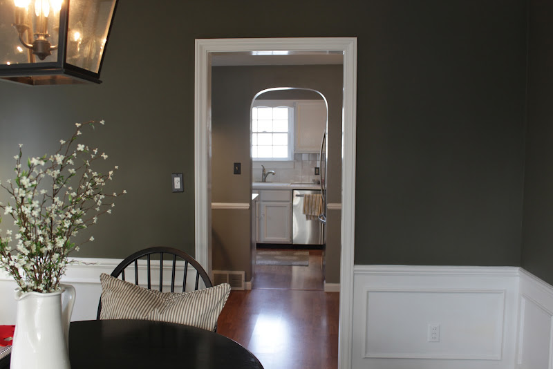
The layout of our kitchen is totally choppy, and I totally dislike it! Our dining room leads to a small eating room with a bar area, which then leads to a galley style kitchen. I tried to take pictures from multiple angles so you can see the layout firsthand.
The GOOD thing, of course, is that we plan to remove the wall between the kitchen and eating area, and widen the opening between the eating area and the dining room. This project is at least a year away, but it is going to make a HUGE difference in the house! I've been super excited about this project from the second we moved into the house. Even though its super annoying as is and we knew we'd have to live with it this way for a couple of years, we couldn't help but see that it has a ton of potential! We are packing away and saving $$$ little by little so we can do it exactly the way we want it when the time is right.
This weekend, I made a 3D rendering of what it will look like post renovation, which I will share with you tomorrow :) In the meantime, see the kitchen in its current form below:
Also, since we knew we'd be living with it for awhile, we did give it quite the mini-makeover already. We painted the cabinets white and the walls grey, so even if we didn't love the layout at the least the feel of it feels a lot more like us :) We also put new hardware on the doors and drawers and got a new fridge and dishwasher!


You have a great sense for decor, I really like the colours you chose!!!
ReplyDeleteI would be extremely grateful if you carry on with superiority what you are helping right now with your blog. I actually enjoyed it. Mostly i use instastalker
ReplyDelete